Dashboards
Click here for detailed instructions on how to request a Dashboard Data File (pdf)
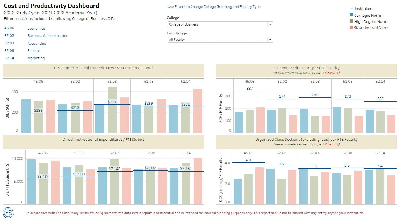
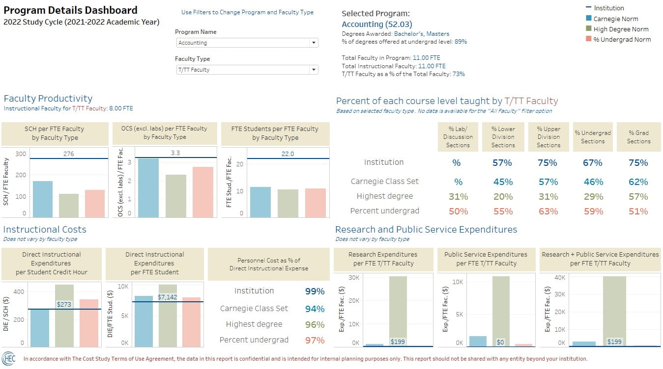
The dashboards were created to help institutions interpret their annual data from The Cost Study at UD relative to the national norms. All three benchmark group categories from the norms have been included for comparison (Carnegie Classification, Highest Degree, and Percent Undergrad).
Note: Tableau Desktop dashboards may need to be resized to fit correctly on your computer screen. See sample screenshots below for what they looked like on our computers.
- On the Cost and Productivity Dashboard, simultaneously view four metrics at one time, with a filter by College/School to view similar programs together.
- In the Program Details dashboard, explore additional details about costs and faculty teaching loads for one program at a time.
- Use the faculty type filter to explore productivity metrics for tenured/tenure-track faculty, other regular faculty, supplemental faculty, and TAs.
- Build additional tables and dashboards with the newly formatted data structure.
The data file is available in Excel, or as part of a packaged Tableau workbook. One worksheet has your institution data for this study year, and a second worksheet has all the norm data. The two worksheets are linked based on study year, 4-digit CIP, benchmark group, benchmark group category, and faculty type. A third worksheet includes all of the variable names with a short description and definition. Additional metrics from the Cost Study data tables, standard deviations, norms for the 2-digit CIPs and sample sizes are also available.
Data pictured in the images below were created for illustrative purposes and are not actual data from The Cost Study at UD.


